|
The ArtistŌĆÖs Poster -
Throwing Bridges And Crossing Borders In The Fine Arts
An essay by Annette C. Disslin
Grieshaber, Warhol, Picasso, Hundertwasser, Toulouse-Lautrec, Max Bill, Joan Mir├│, Georges Braque and the Br├╝cke artists have all, at least at times, made the artistŌĆÖs poster their topic and their challenge. Be it Expressionism or Op Art, be it woodcut or screen print, traditional or provoking, be it editions of 200 or 10.000 copies. It seems as if there was no common denominator for what we call an artistŌĆÖs poster. However, there is one. What they all have in common is their bridging of what so far has been looked at as being far apart.
The artistŌĆÖs poster had its first great success in the late 1950ies. Picasso, Braque, L├®ger, Chagall nearly at the same time discovered the printmaking technique of lithography and the poster as a special form of art work. Especially Picasso, being a person who loved to explore the so far unknown, energetically tried to find out about possibilities and options of the freshly discovered printmaking medium. After World War II two French companies have had central function as to artistŌĆÖs posters. For the first this was the printing office of the brothers Mourlot, where nearly all then well known artists went to for printing their atristŌĆÖs posters or have them printed, and, secondly, this was the Gallery Maeght, that gave birth to the idea that there should be a poster for every exhibition designed by the artist whose art work was to be on show. Maeght junior founded his own lithography printing office later on, other Galleries, e. g. Berggruen & Cie., followed the path and made their artists design their own posters. There was a general boom of printmaking and artistŌĆÖs posters during the 1960ies.
There have been artistŌĆÖs posters earlier on, that is before World War II and towards the end of the 19. century, but rather scarcely. For quite a long time the fine arts were understood to be free, which in the first place meant they had to be free of any purpose, in other words: they were not allowed to be useful. Thus there was a deep trench between printmaking, which was supposed to be free of any purpose, on the one hand, and commercial graphics, that were supposed to do a good job, on the other. This gorge was bridged by artistŌĆÖs posters again and again. Gradually artistŌĆÖs posters were not only used for exhibitions of the artistsŌĆś own art work, but for a wide variety of cultural events also. There even were series of artistŌĆśs posters, e. g. for the Olympic Games at Munich in 1972 or for the Donaueschingen Days of Music. With their posters artists gave statements against war, against offences against the Human Rights, against environmental pollution. The poster was a means by which art walked out of the galleries and the museums to meet ordinary people that would probably never have entered an art gallery. The poster became what was called ŌĆ×art of the streetsŌĆ£.
Andy Warhol and Friedensreich Hundertwasser have, each in his own way, blurred the line between original and reproduction. Warhol rejected the idea of there being any such thing as an original alltogether. Hundertwasser was fascinated by the opportunity of having a huge edition of prints by using the screen printing technique. Thus he produced thousands of copies and legalized them in fact by stamping his signature on. There were companies brave enough to cross the borders by commissioning artistŌĆÖs posters. In this way a remarkable series of touristic posters was made for Air France around 1960 by Georges Mathieu, one of the then most famous painter artists in France.
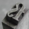
From the 1950ies onwards HAP Grieshaber and Horst Jansen continually produced artistŌĆÖs posters in Germany and thus prepared the ground for the big success the artistŌĆÖs poster had during the 1970ies throughout Europe. A very special sort of crossing over can be illustrated by taking a closer look at the posters of these two artists. Grieshaber, a learned composer, used metal or wood type for the texts in his posters. Jansen, however, used his very characteristic hand writing. Henri Matisse, who in the course of his illness developed his technique of paper cuts (papiers d├®coup├®s) , used exactly this method for the written parts in his posters: he glued on characters cut out of coloured paper. There always had been a demand for that text and design of an artistŌĆÖs poster had to come from the artist himself, which holds true in all the described cases. However, Jan Tschichold, one of the famous and very strict typographers of the 20. century, believed that any personal style like in a hand writing was a superfluous nuisance of the reader noxious to the pupose. His claim was that the hand writing of the designer may not disturb the communicative job the design has to do. This border, too, artists have crossed with their posters, thus giving evidence of the contrary: that by using his own and recognizable personal style a message can be told as well or even better.
In fact the case of the artistŌĆÖs poster is another strong plead for using definitions and drawing sharp lines within the fine arts should only be done with an extra amount of care, as quite often it is the crossing of lines that opens new directions.
Further Reading:
Juergen Doering: Kuenstlerplakate - Picasso, Warhol, Beuys ...
Editor: Museum of Kunst und Gewerbe Hamburg for an exhibition running 19 March to 10 May 1998
K├╝nstlerplakate: Frankreich/USA Zweite H├żlfte 20. Jahrhundert. Hans Wichmann, Florian Hufnagl, unter Mitw. von Corinna Roesner.-Basel; Boston; Berlin: Birkhauser, 1991 (Industrial design - graphic design; Vol 10) ISBN 3-7643-2563-1
|